SPRING 2026
Haven
Role
Duration
Team
Tools
PROBLEM
Current location discovery tools rely on static reviews that fail to show real-time crowding or noise levels before arriving, turning the search for a comfortable space into a high-friction gamble.
SOLUTION
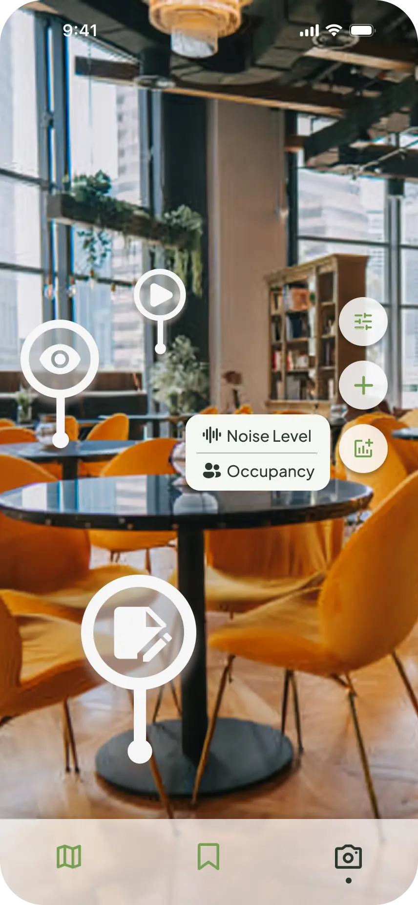
Haven is a location discover app combining real-time transparency with augmented reality, letting users check crowd and noise levels via telemetry before unlocking an AR camera to explore context-pinned media posts inside. The app bridges everyday social discovery with the memories of physical spaces.
IMPACT
- •Data-Backed ValidationUsed insights from 44 respondents to ensure high-demand capabilities took precedence
- •Streamlined Scope DeliveryCreated an end-to-end product architecture under strict 48-hour sprint constraints
- •End-to-End ExecutionConceived the core product concepts and functions and directed the entire design strategy
Initial Research
44 people between the ages of 18-30 were surveyed. We discovered that:
77%
identified a "comforting/relaxing atmosphere" as the #1 feature that attracts them to a physical location
62%
expressed interest in real-time occupancy and noise level visibility to help them navigate potentially crowded environments
46%
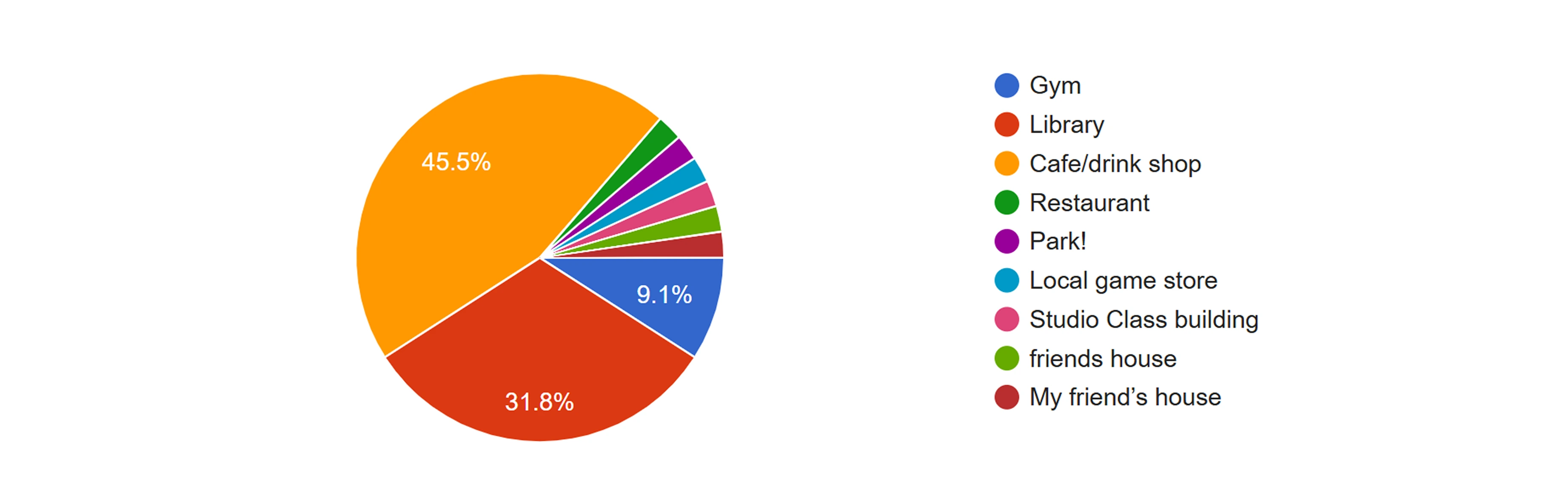
rely on cafes and drink shops as their primary "go-to" place outside of their home to feel a sense of belonging
31%
expressed a desire to capture the community feeling of local spots digitally, but noted that traditional social media fails to replicate this
Scoping & Trade-Offs
We chose to focus on seating capacity and noise levels as our core functions because they directly address the most frequent physical bottlenecks, while naturally supporting secondary desires like ambient focus and aesthetic comfort.
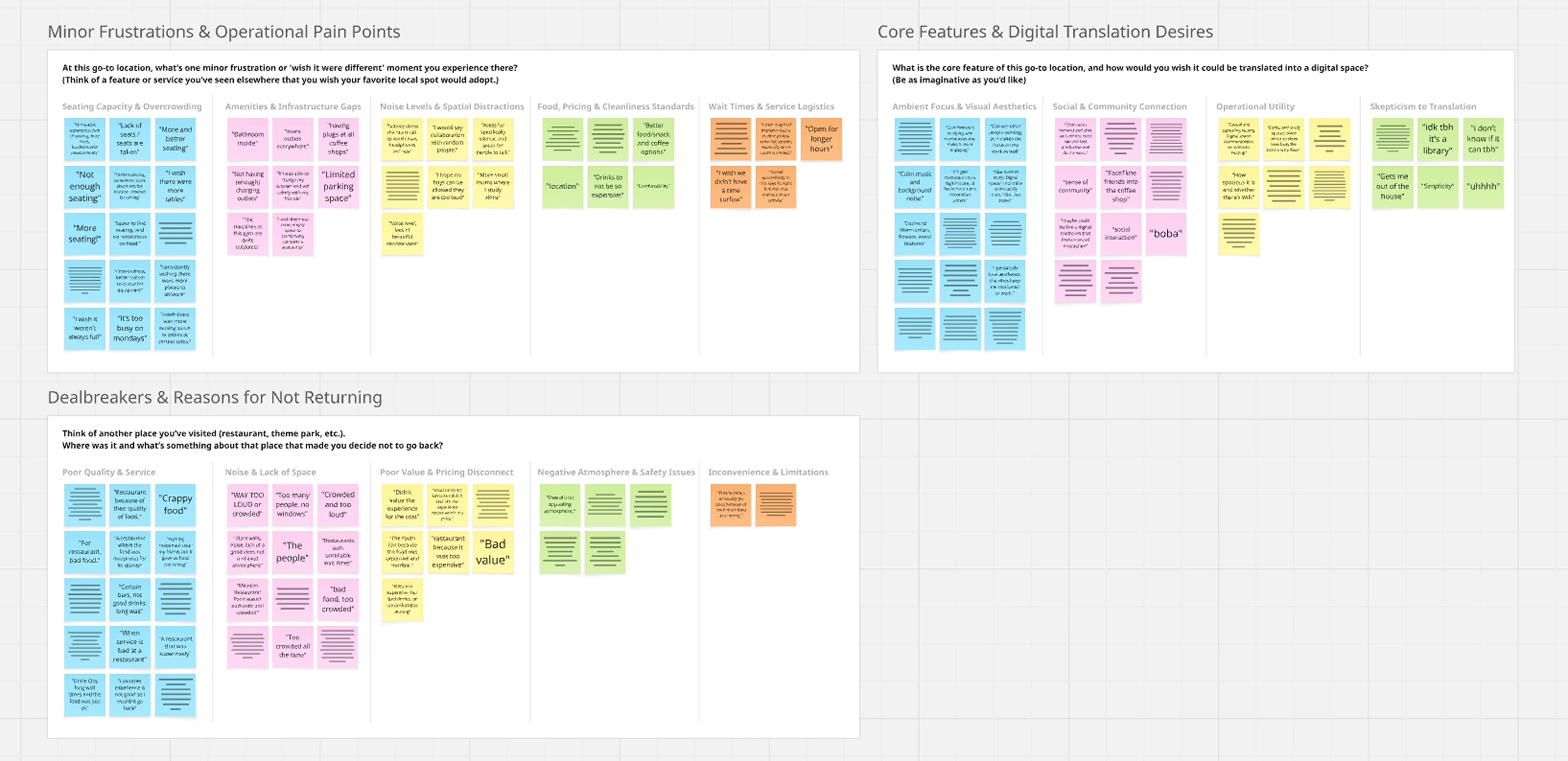
Conversely, we explicitly deprioritized frequent qualitative complaints concerning physical amenities and poor service or food quality, as these fell entirely outside the practical scope of what a digital discovery app could solve within our timeframe.
User Behavioral Archetype
Seeking a Place to Focus
“Sometimes there’s no seats or way too noisy so I can’t focus or get any work done. I usually go to certain spots like the gym, library, or cafe with a certain goal in mind but depending on how packed it is sometimes I can’t get a spot and have to leave.”
Goals
- • Secure available seating
- • Maintain focus
Frustrations
- • Overcrowding
- • Excessive noise
Seeking a Less Stimulating Environment
“I didn't like how overwhelming it was... I didn't like the popping colors, too many options, and how it was too personal feeling (i.e. 'What do you want for this?'). Sometimes you want that stoicism.”
Goals
- • Calming environments
- • Minimalist design
Frustrations
- • Overwhelming stimuli
- • Forced interactions
Seeking a Connected Community
“Can interact with friends and strangers in a physical setting. It’s difficult to imagine in a digital setting, but it’d have to allow for people to directly interact with one another (either by sending each other material things, or by allowing the digital interaction to have a physical impact on one another.”
Goals
- • Physical social connection
- • Tangible digital interactions
Frustrations
- • Unnatural digital settings
- • Disconnected virtual barriers
Critical Evaluation
Working against an aggressive 24-hour deadline, we transitioned straight from data synthesis to high-fidelity UI.
While the initial prototype successfully brought the AR concept to life, a post-sprint evaluation revealed a core mismatch: it over-indexed this feature while sidelining the practical logistical tools that respondents actually wanted.
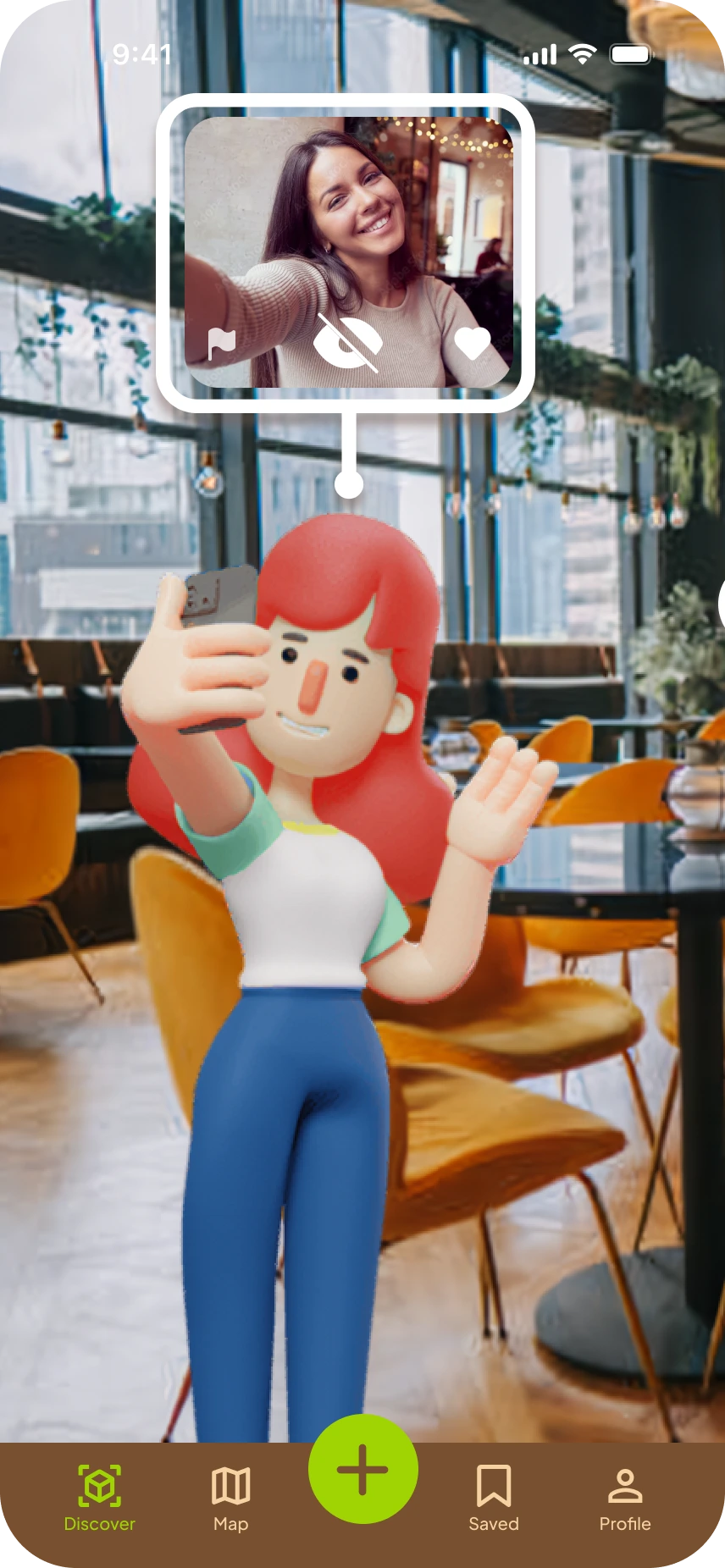
- App opening to the camera is jarring
- Forced to travel just to view posts
- 3D characters can be overstimulating
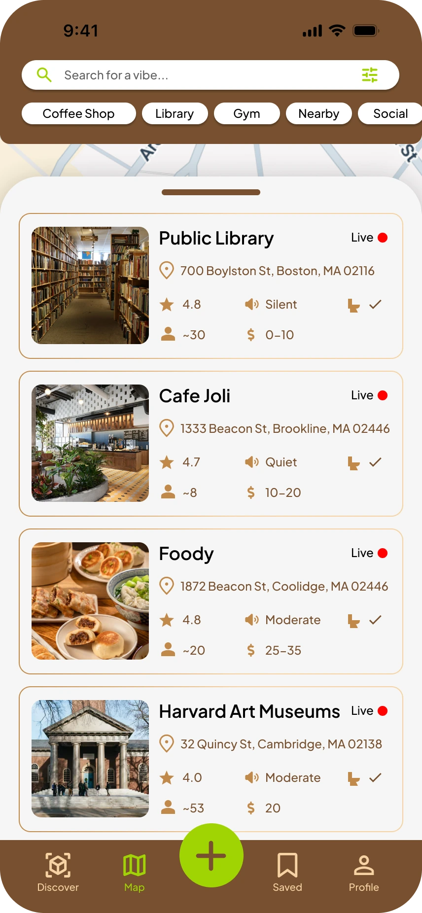
- Mixes too many icon & text pairings
- Noise level & occupancy are buried as secondary information
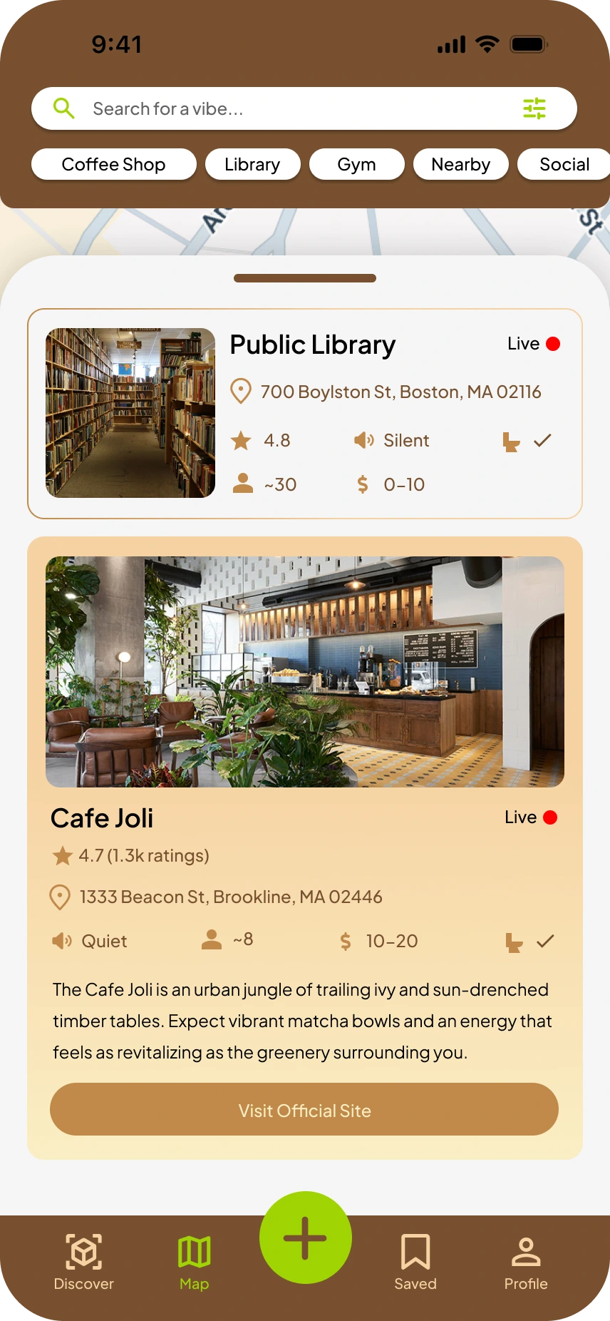
- Hues blend everything together
- Long and unnecessary description
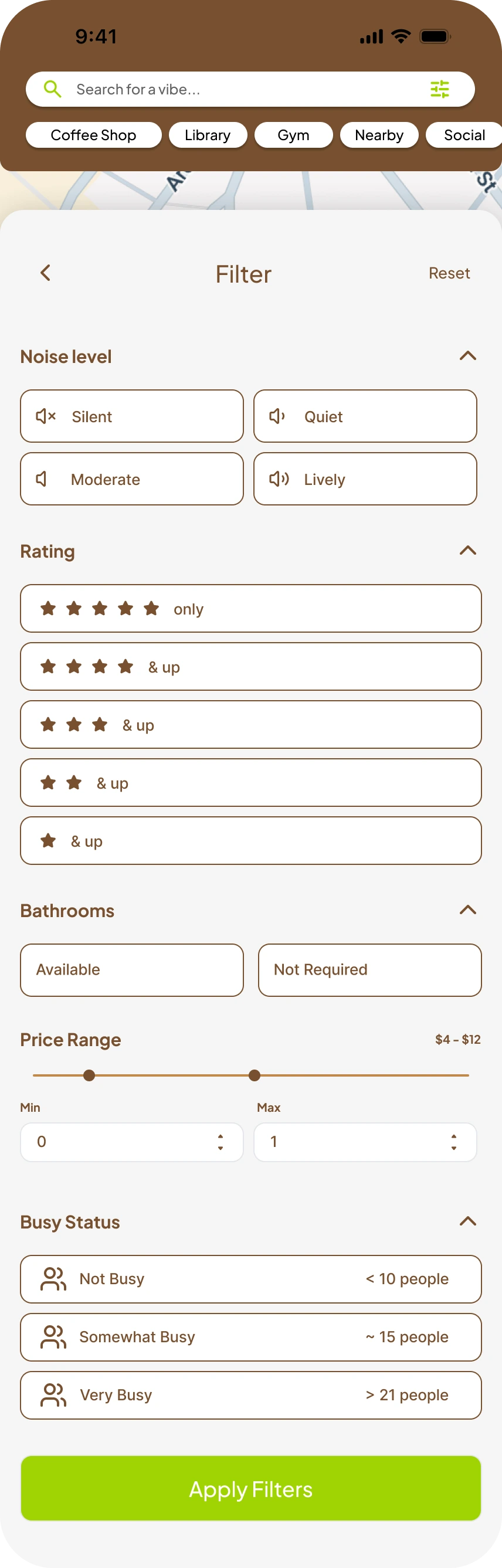
- Stacks too many parameters vertically
- Noise levels are subjectively described
- Some important filters are too low in the hierarchy
Pivoting
Wireframes & low-fidelity prototypes for a new layout that better caters to the needs of our survey respondents.
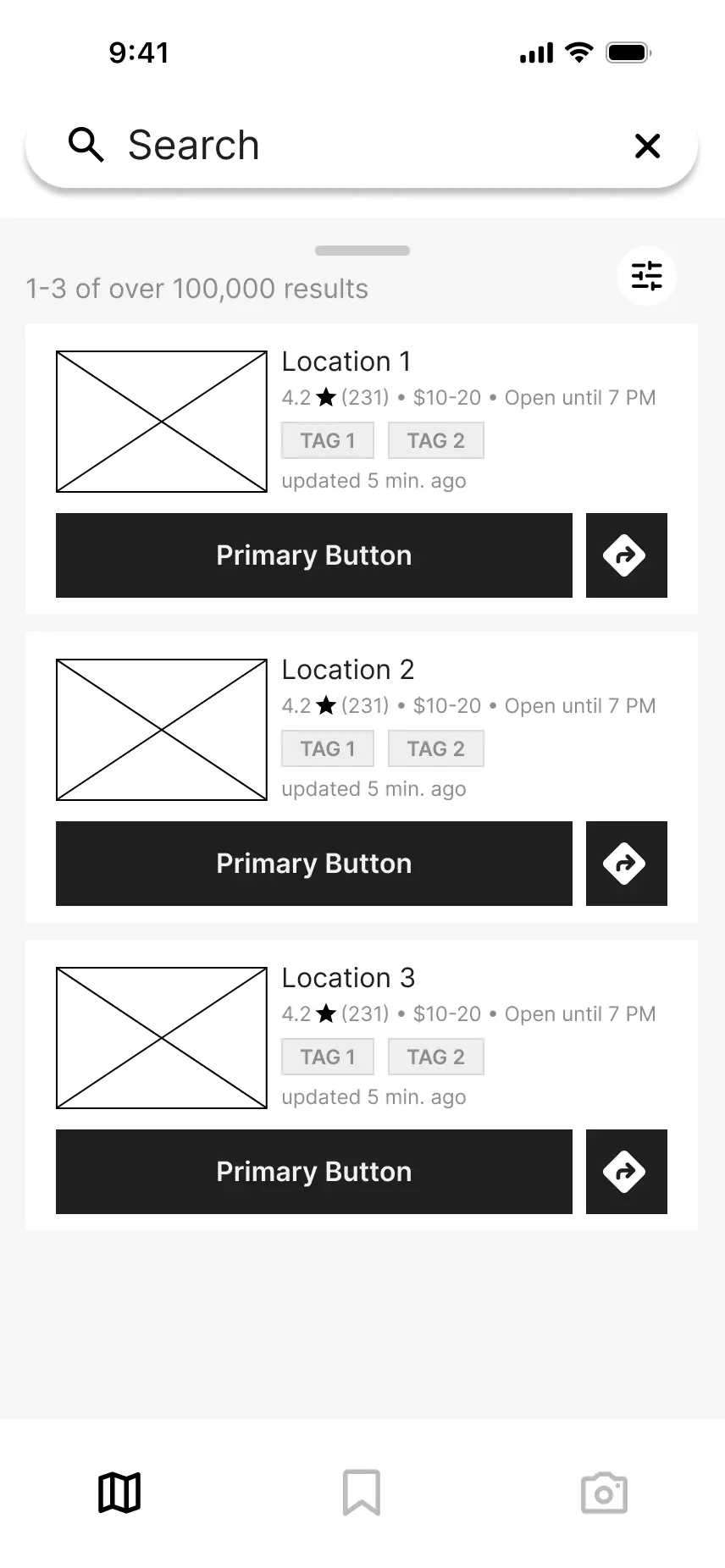
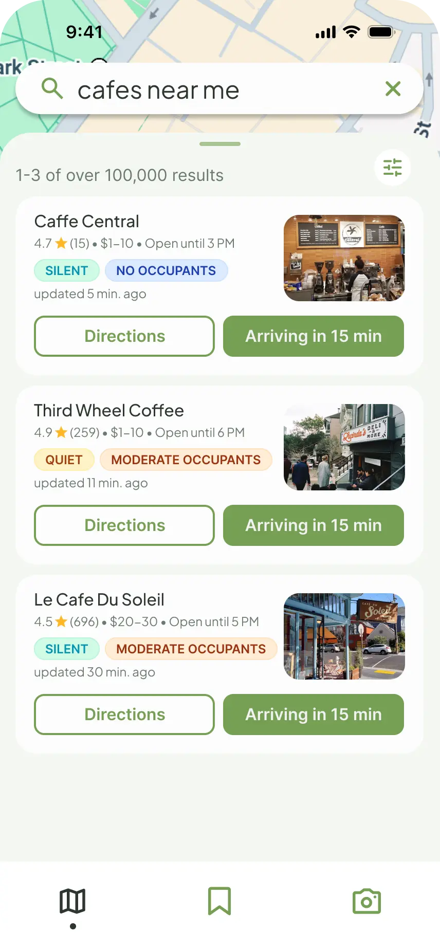
- Swapped the initial screen to a content-rich discovery feed
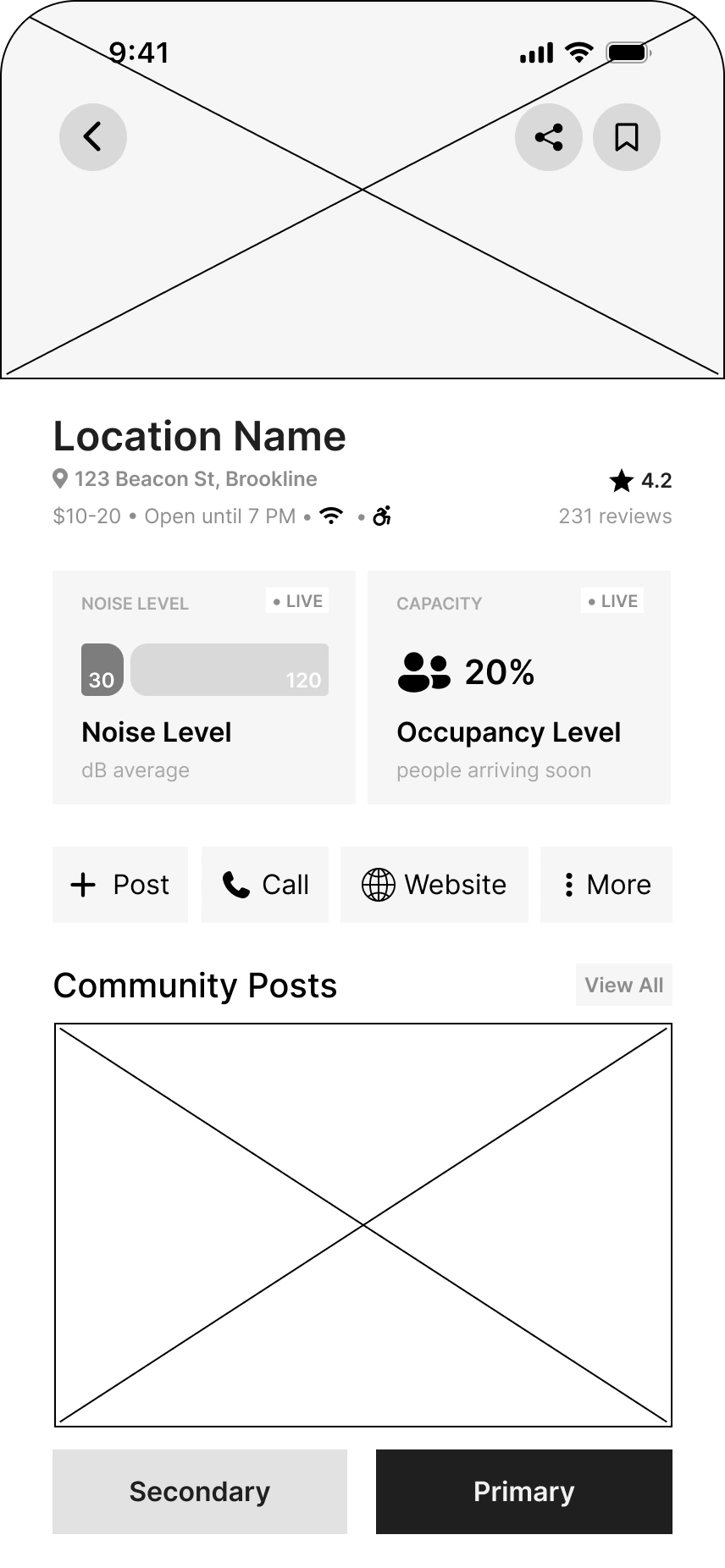
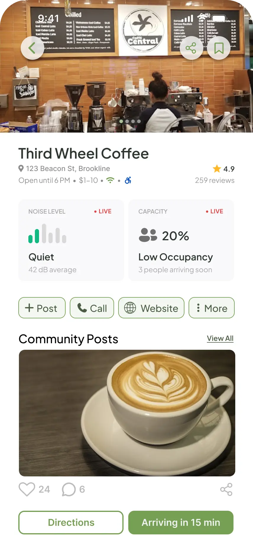
- Highlights important info like noise levels and occupancy

- Removed 3D avatars in favor of simple nodes
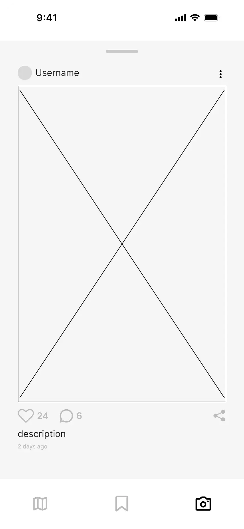
- Turned the community post card from 3D to 2D for better legibility
Final Product
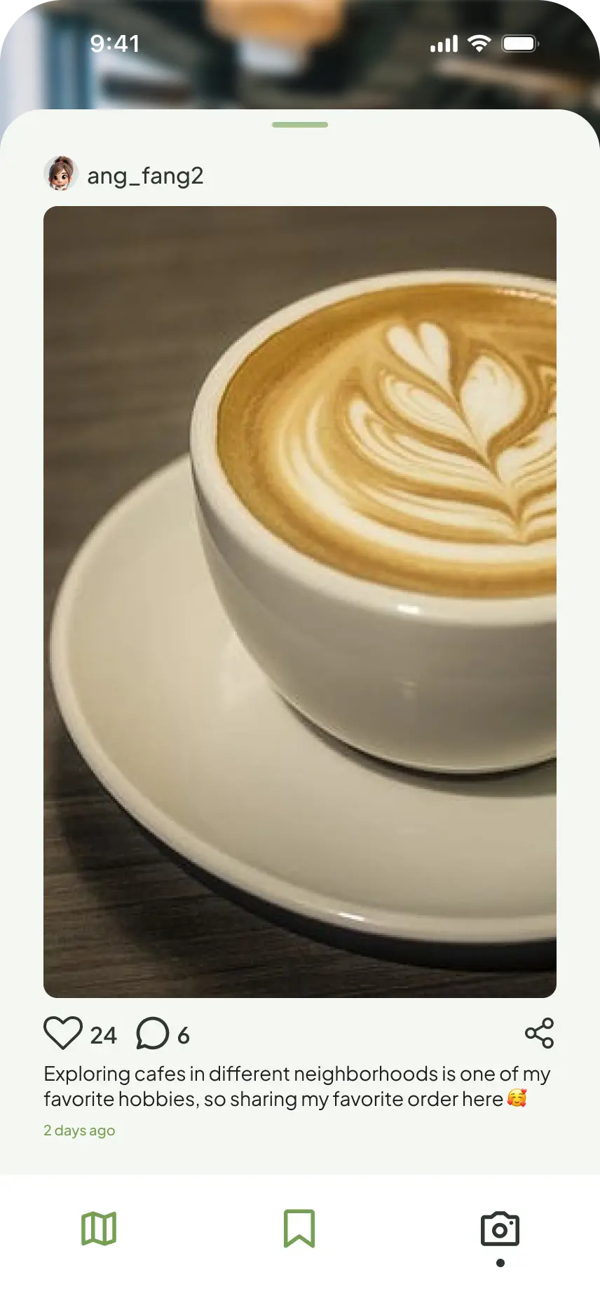
Overwhelming elements and buried data are replaced with an intuitive layout built for fast information scanning. The interface prioritizes real-time noise level and occupancy accuracy through community-driven user reports. By establishing the primary call-to-action around notifying the app of their arrival, Haven transforms passive map browsing into an active, crowdsourced ecosystem.
Where the Product and I Go From Here
Because this concept was executed under an aggressive sprint constraint, we prioritized exhaustive quantitative and qualitative survey synthesis over iterative multi-round usability testing. This upfront data-backed foundation ensured every design decision was rooted directly in proven user friction points rather than guesswork.
While direct post-launch usability testing remains the natural next phase, the rigorous behavioral scoping established in this sprint provides a bulletproof foundation for future user validation cycles.
Next steps
- Introduce automated check-ins and check-outs to reduce reliance on manual arrival taps
- Implement personalized thresholds that let users save specific preferences for noise levels, occupancy, and other environmental factors
- Design a gamified system that encourages active user contributions for noise levels and occupancy telemetry